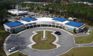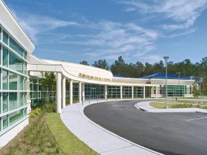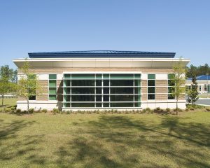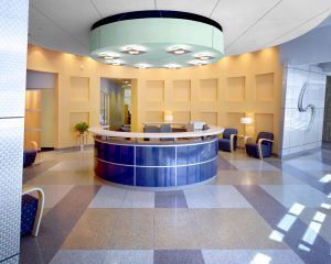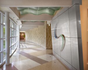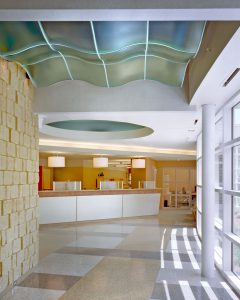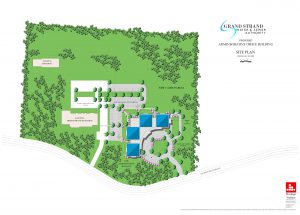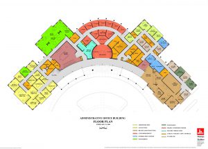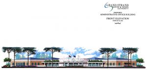


The Owner occupied an older building nearby, but due to its expansion, was overflowing that building. Their program called for a new office building to house all its central administration, excluding its field engineers, who were to take over the existing office building. A distinctive building was requested, with a street presence that led the public to the front entry and the drive-thru payment window. The architect was provided with a list of employees in each department, along with requests for future spaces for expansion. This office building is laid out with the individual departments connected by a corridor running along the front of the facility. The glass lined corridor invites the public inside, and makes it easy for visitors to locate the appropriate department or individual office for which they are looking. This action is further facilitated by the central reception desk and waiting area, centrally located along this corridor. One end of the corridor leads to the billing payments area, the spot most often visited by the public. Immediately behind the reception area are the service representatives’ offices. These have glass fronts along the hallway to allow the department supervisor to check on work being done and who is available for the next visitor, and have the pubic know that the Authority has no problem allowing the public see what the service reps are doing. The individual departments (admin, finance, engineering, service and billing) all have internal connectors away from the main public corridor. This eases interaction inside and in between the departments. The program included a large conference room, with seating available for the public, as Grand Strand Water and Sewer is a semi-government agency. This room is set up such that in can accommodate board meetings, interdepartmental meetings, grievance hearings and be utilized by the public upon request. The arced front of the building serves a dual purpose. This shape naturally draws visitors toward the center entrance. It also gives the facility the curb appeal requested by the Owner, as the building presents differing views from passers-by on the highway. The public driveway fits neatly inside the crescent formed by the building. The circular drive and parking at the front of the building results from the nature of most visits to this facility, which consist of running in to pay a bill. The drive is laid out such that parking next to the door for a two-minute bill payment will not interfere with the parking spaces. There is a separate drive-up window loop for those who do not need to go inside for any business. Employee parking is located at the rear to both screen the parking area from the road and to allow the new parking area to be shared with the existing office building which remains in use. Construction: Slab on grade concrete, steel frame with steel joists at flat roofs, metal stud framing at walls and sloped roofs, aluminum storefront, stucco exteriors w/ masonry water table and metal roofing.
