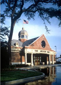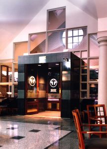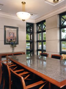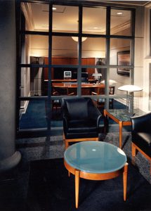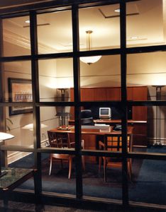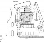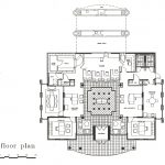

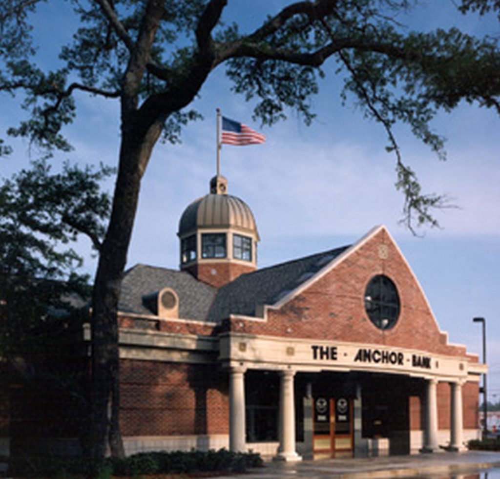
The relatively new and local area bank, Anchor Bank of Myrtle Beach, wanted to expand to the Georgetown area. The directors desired a building that would stand out, but stay within the conservative and historically-minded outlook of the Georgetown community. The chosen site was a street corner out parcel at an existing strip shopping center, so the building had to be accessible from both the front, street side, as well as the rear, parking lot side. The resulting design used a brick masonry veneer to match many of the older full masonry buildings in Georgetown, along with a stucco fascia textured and colored to resemble stone. The brick gable end walls copied elements seen in local plantation houses. Chippendale frame patterns in the windows and in applied metal appliqués at the fascia help complete the colonial look of the building. A windowed cupola with a copper dome roof adds to the historical aspect while allowing natural lighting to reach the public spaces inside. This project included a complete design of the interior. The reveals in the exterior masonry are continued indoors utilizing metal reveals in the painted gypsum board surfaces. Interior window walls repeat the patterns seen in the exterior windows. All fixed furnishings are original designs by Mozingo + Wallace. Located in the historic coastal village of Georgetown and completed in the fall of 1992, the facility is a branch bank designed to represent financial stability while identifying architecturally with the historical heritage of the area. The 3,000 square foot facility projects the semblance of a turn of the century financial institution with its simulated limestone water tables and fascia, rusticated masonry banding and copper clad dome. The theme is carried internally with voluminous crossed ceiling vaults, centerpieced with the clerestory dome, providing an abundance of natural light from above. The plan is symmetrical, consisting of two executive offices, a conference room, employee lounge and a central lobby/teller line with adjacent customer service and waiting areas. The lobby area is balanced by a four-station teller line, centerpieced by the main check writing desk beneath the cross-vaulted clerestory dome above. Detailing and finishes translate into scaled, traditional elements, stylized to represent a progressive but traditional interior through the use of drywall with inlaid horizontal reveals, painted with textured coatings to represent limestone, complemented by traditional painted moldings and casings and cherry veneered doors and casework. The check writing desk and curved teller front were custom designed and constructed with cherry veneers highlighted with black inlaid reveals, marble inserts and brass grille overlays. Furnishings include cherry wood desks with custom veneer inlays and chairs upholstered in either black leather or dark teal matrix fabrics. Flooring patterns with the central lobby/teller area consist of granite and marble patterns with brass inlays. The remainder of the flooring in the facility is a deep teal matrix carpet with inlaid linear black carpet. The matrix pattern and color echo the designs within the upholstery fabrics, representing the square patters and details found throughout the facility, while the inlaid linear patterned carpet acts as a base for the furniture within the designed areas, repeating the black color found on the leather upholsteries. The facility, through the use of modern detailing, economical materials and richly patterned textures and colors, presents an image of the older banking institutions found within the area a century ago. Construction: Steel Frame with metal stud walls and brick veneer. Cold rolled steel framed roof with standing seem metal roofing. Interior walls metal stud framing with gypsum board. Floor finishes combination of carpet and tile over concrete slab.
